The general idea was to create a blog for a E-commerce website, the objective of this blog was to attract potential readers that with the time convert on potential buyers. In this blog we can speak about all the advantages of having a better live with products that the company sell.
SECTIONS
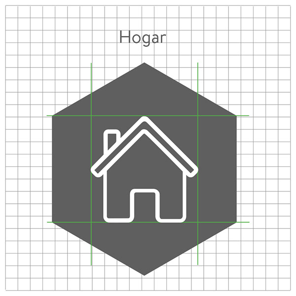
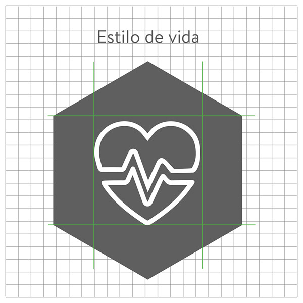
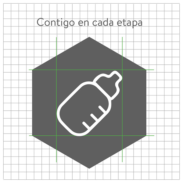
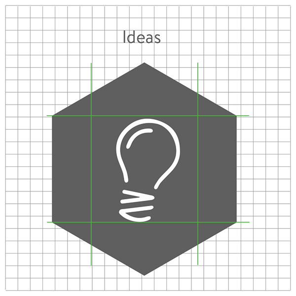
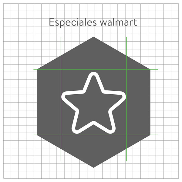
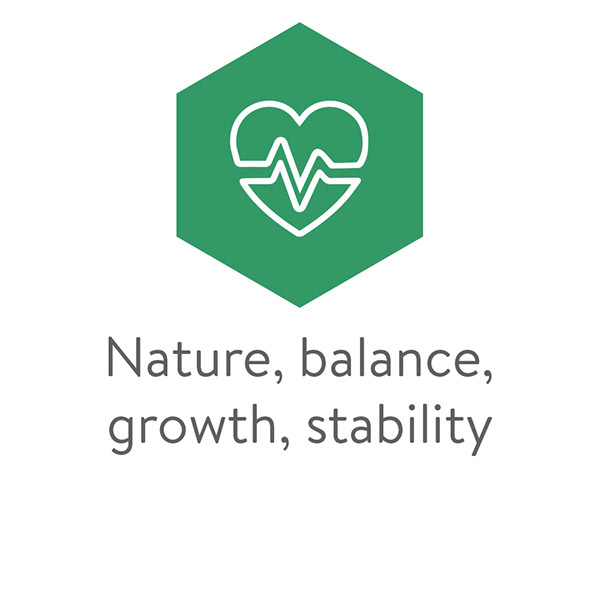
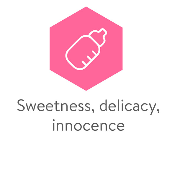
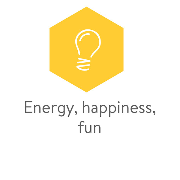
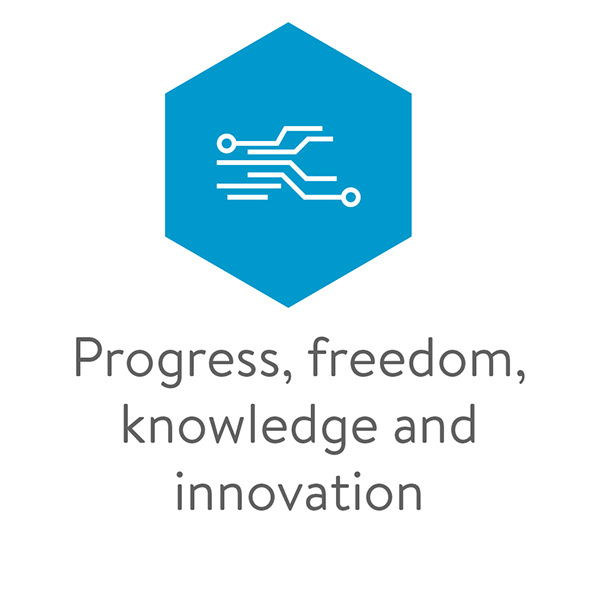
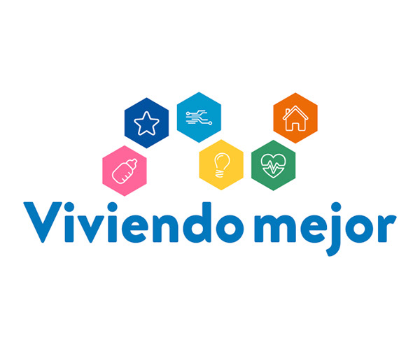
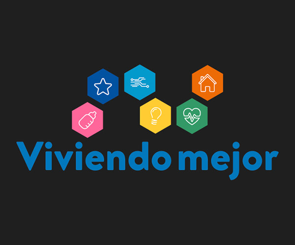
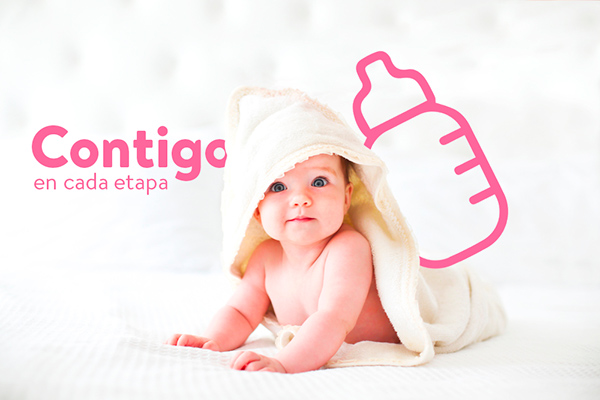
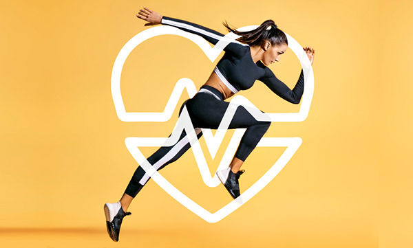
So for this first step the idea was to separate all the categories or niches that the blog could be divided. I decide to create some basic elements or icons that would represent each niche, that way we can start to unify the different elements that could live in the same space and how will they interact with each other.
PANTONES
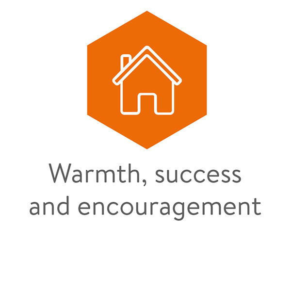
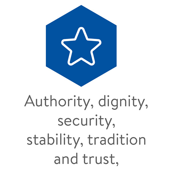
PANTONES To select the correct pantone of each category I use the color psychology and each color have different meanings.
TYPOGRAPHY
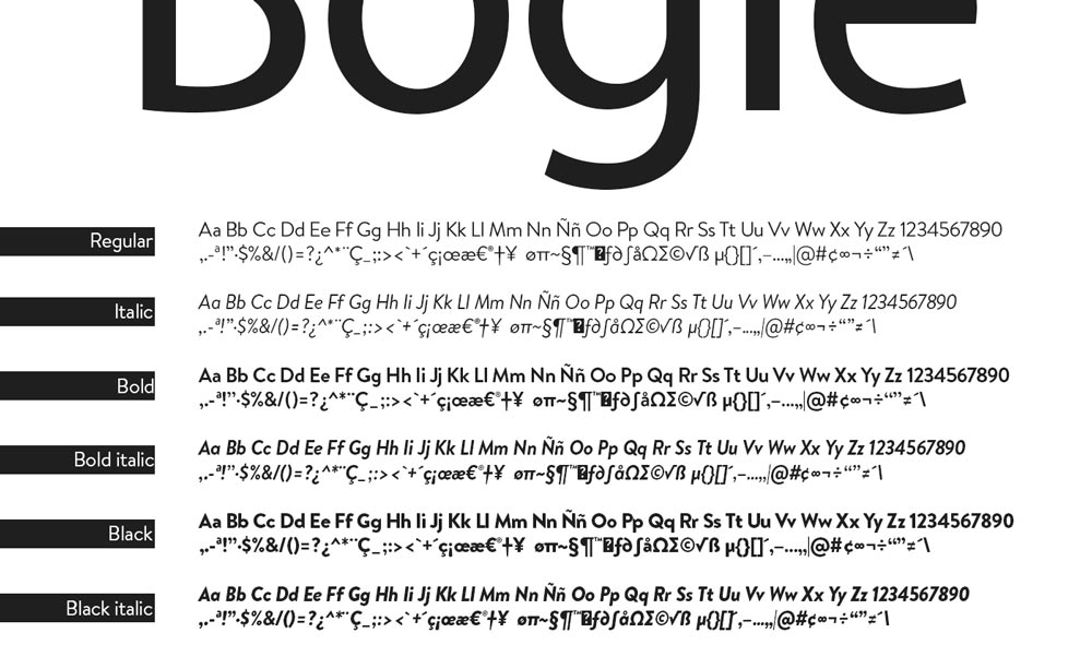
I use the bogle typography to this case for its flexibility and friendly lines, this font represent delicacy, harmony and stability.
IDENTITY
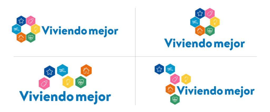
Whit this modular figure, we can play with different positions and alignments both vertical or horizontal.
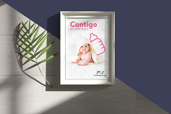
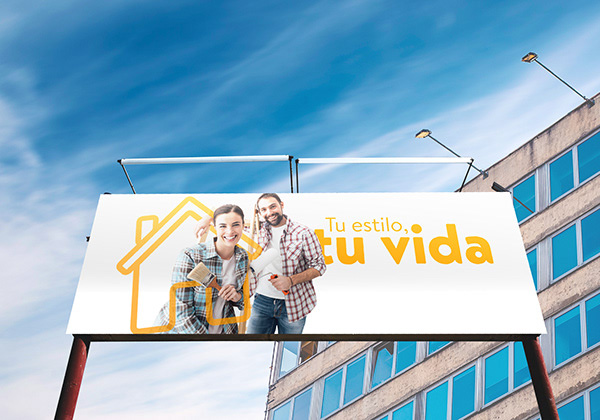
ARTS
For this communication I used the icon elements to create a branding communication design.
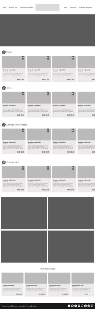
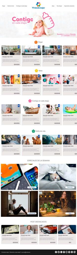
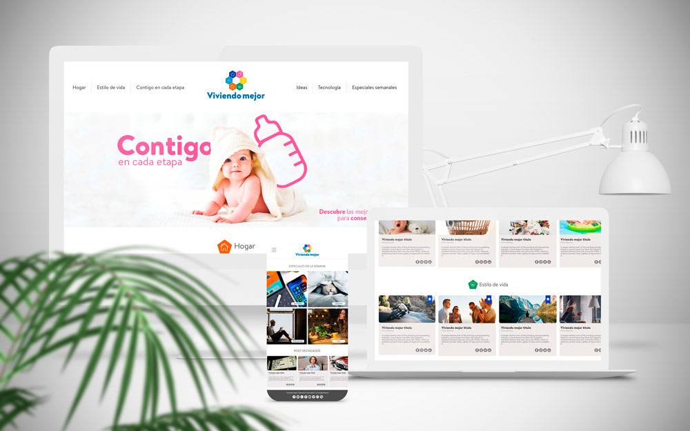
BLOG WEB VERSION
This is a ordered blog homepage, with all the categories separate with unify spaces and visuals
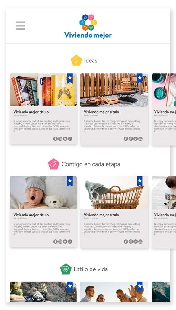
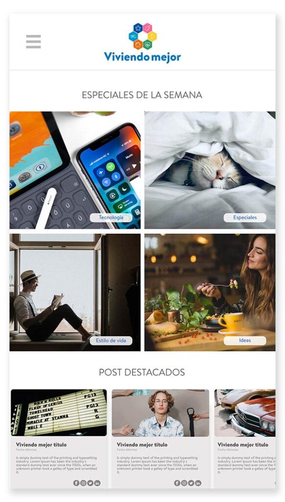
BLOG MOBILE VERSION
This is a ordered blog homepage for mobile version, with all the categories separate with unify spaces and visuals. All the elements ordered below each other or presented as a carrusel to the right.