Since the launch of the new app for Walmart Mexico, I have found a lot of opportunities in the app. Either from the user experience, the journey workflow, layout, etc. For that I create my “ideal app”, this propose is based by the experience and feedback of multiple users and his interactions. I focused in 5 principal sections for this redesigns.
Login
Homepage
Departments
Product detail
Profile
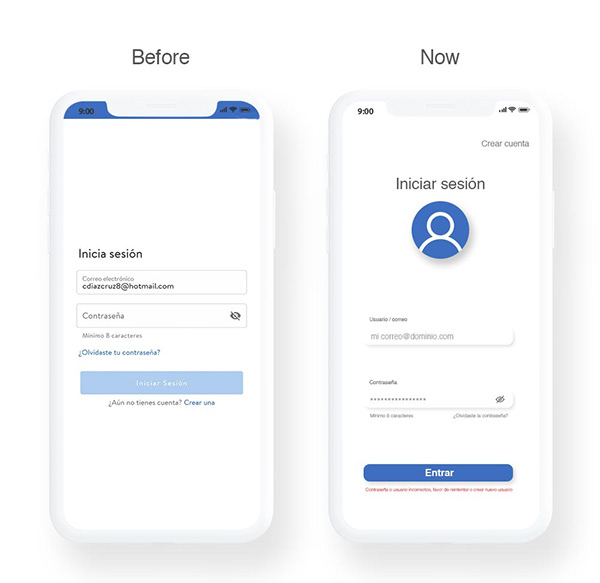
Opportunities in Login section
We have a flat design, it seems like an antique design, is true that have some design relation between the differents screens but it’s not attractive enough and doesn’t have the feeling to want to full the information. For this sections is important to have clarity about the typographic visual impact and weights, contrasts, clarity about what is an explication and what is a field to fill.
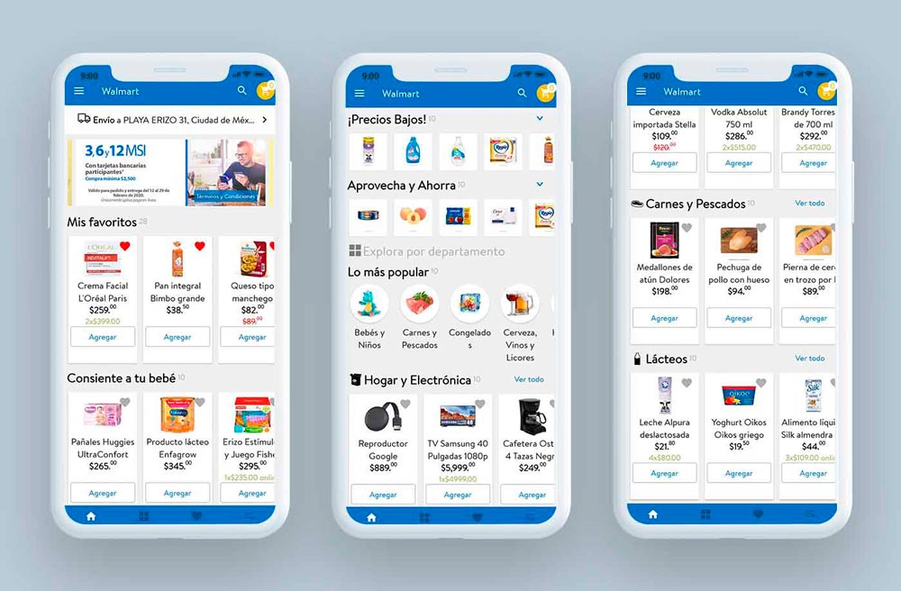
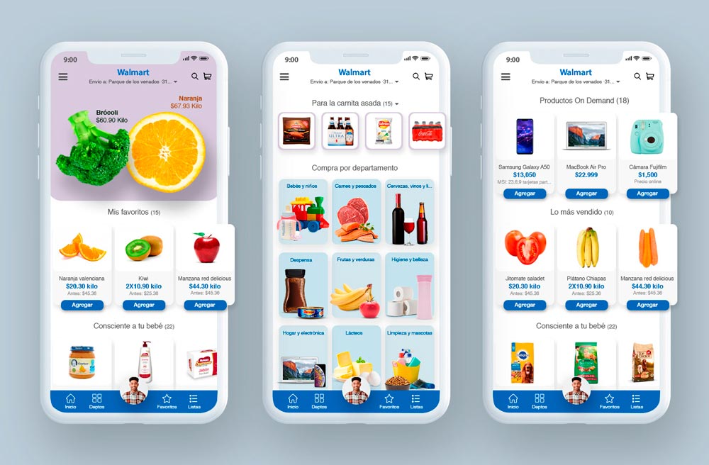
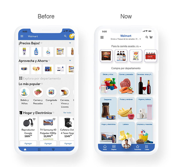
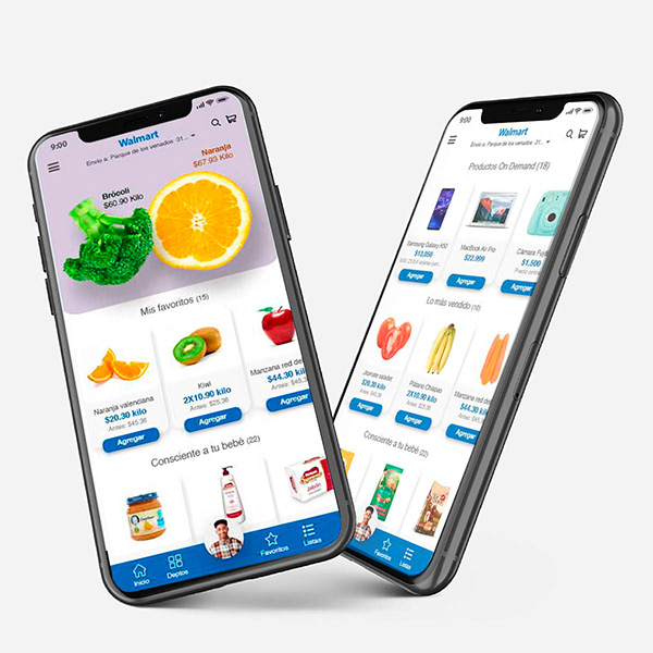
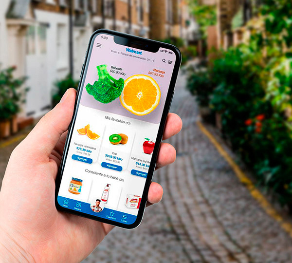
Opportunities in homepage
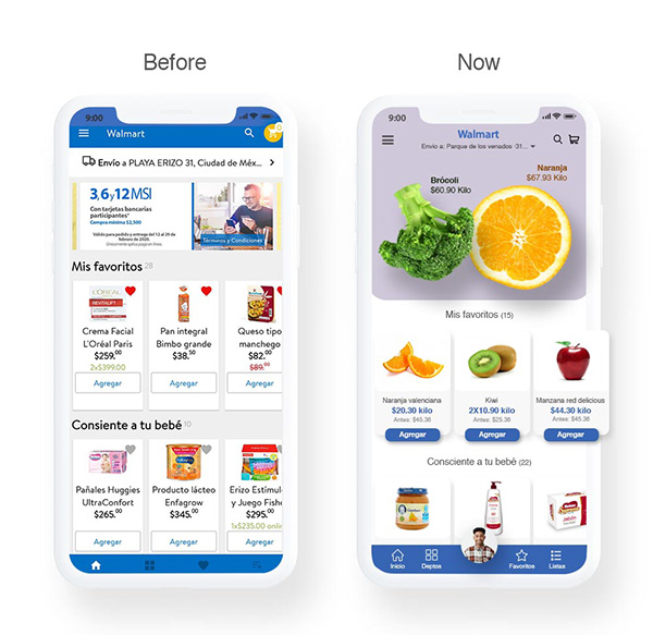
One of the most important opportunities is the saturation and excessive visual noise for the quantity of information that is actually show for a first view. This opportunity is easy detected if we put the same homepage in 3 different views one beside the other.
There’s not a visual weight differentiation of the elements.
The principal banner are not visible and have no lecture of the information.
The resize of the elements is not good enough and the “responsive” is inefficient.
The graphic identity doesn´t are strong enough to make a solid brand.
Isn’t enough space between elements, that make´s the design so stretch.
The menu on the top view is so small to interact and doesn´t understand the information .
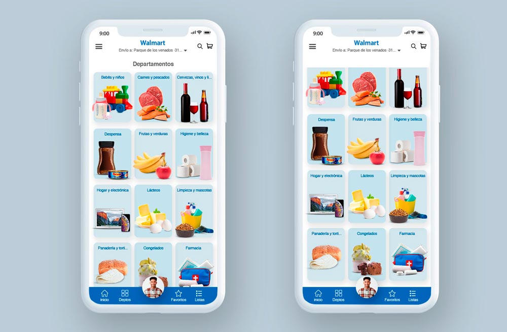
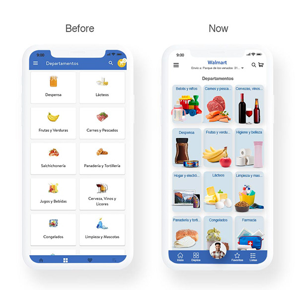
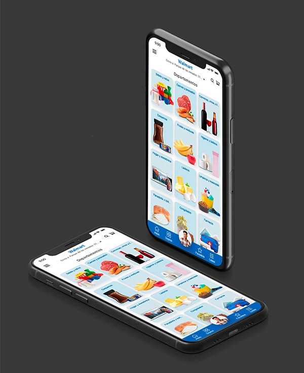
Opportunities on Departments
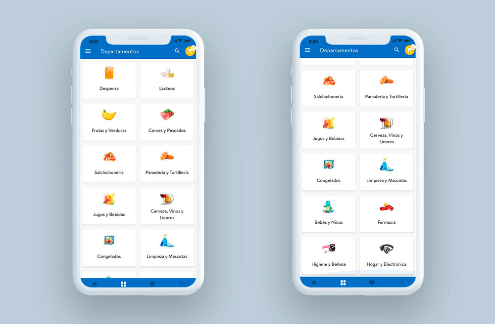
Simplicity in the design, doesn´t have the look n feel and the principal identity of the Walmart brand, the structure is simple.
The images are so small that can´t see or understand what the categories is talking about, one single element does not represent the hole categorie.
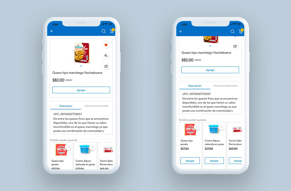
Opportunities Product Detail Page (PDP)
One of the most amazing opportunities in this sections is that you lose the hole control of the footer, you don’t have anymore the control as a user to jump to another section, only can go back.
The visual weight between typography to describe important information and secondary information is missing.
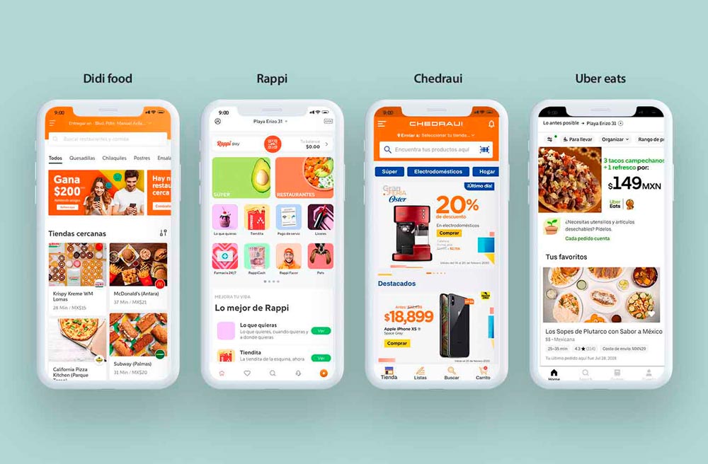
Benchmark
In the research that I made found the main competition from the business, like Didi, Rappi, Chedraui and Uber eats. This competitors adopt a minimalist design, the intention of this design is to represent the brand with the less quantity of distractions possible, keeping just the right and necessary information. The use of the white pantone as a principal base on their visual ecosystem is the principal virtudes of all this apps, the secondary color changing depending the brand.
Wireframes
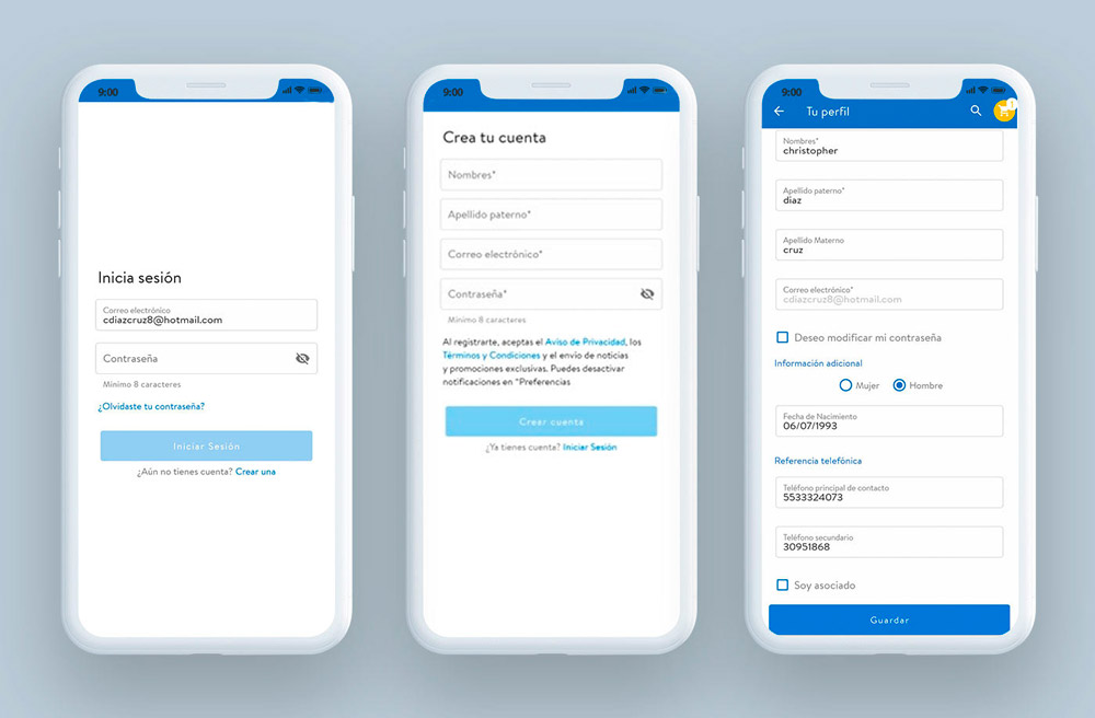
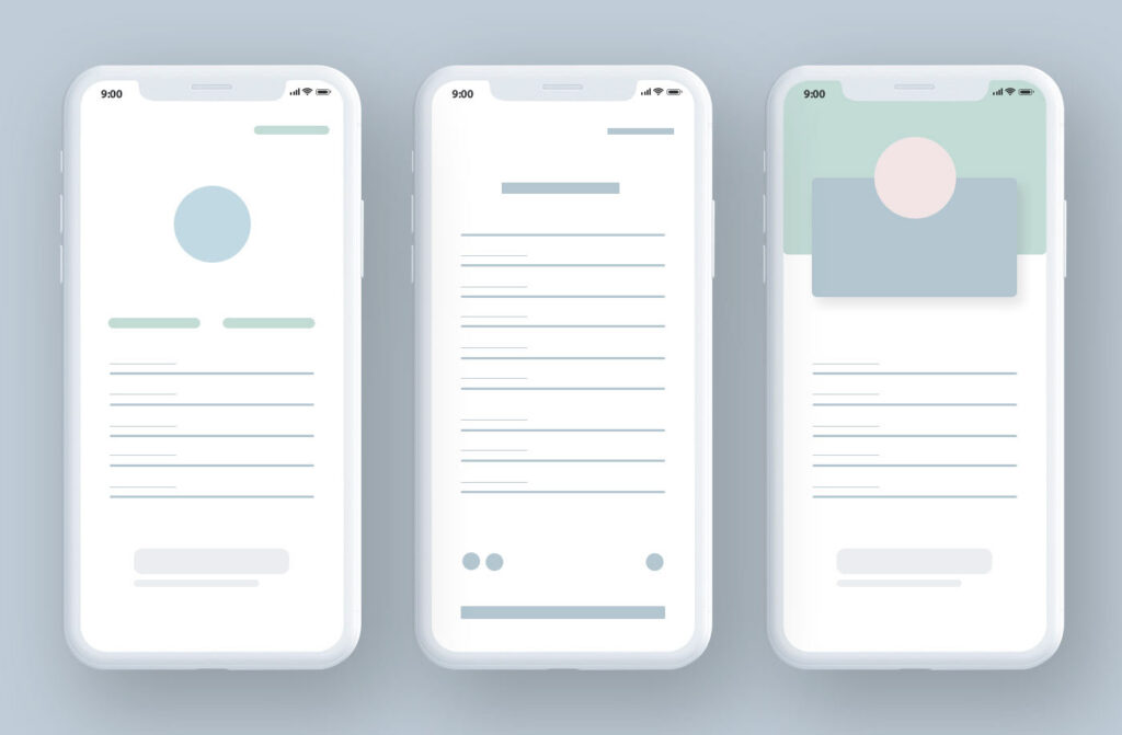
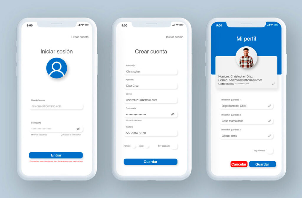
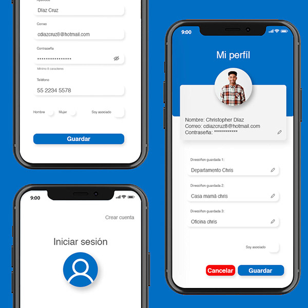
Login / Profile Wireframe
In the first propose we can see a very clean, minimalist and unify design, let it just the important and necessary elements, such as a picture of your profile, name/user, email and password. I create some simple design rules to unify the design between sections, basic forms and shapes.
For the second screen add the create an a new account if you don’t have yet or if it’s your first time. In this version we can see the blank spaces to fill the form, but still conserve the minimalist and visual design.
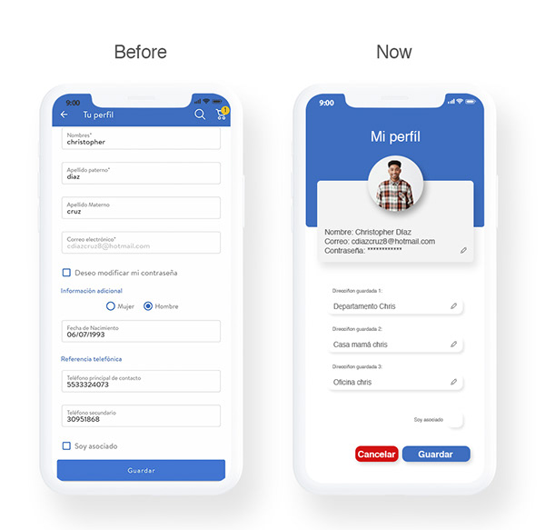
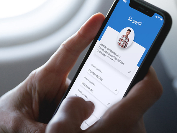
For the 3erd screen is for user profile, we can see some options to edit your information in case of it´s necesary, such as delivery, add or quit directions, etc.